Tuesday, June 26, 2012

How to choose drapery hardware

The devil is in the details and simple decisions can lead to big impact both good and bad.  Since there aren't any  absolutes in decorating, things often  come down to personal preferences.  One of the the things I'm fussy about is what colour rods to use to hang drapes.


There's lots to choose from.

Metal hardware is available in a variety of finishes : wrought iron,  aluminum, chrome, brass, and oil rubbed bronze. Wood hardware is available in almost any finish, from natural blond to dark espresso.
types of drapery rods
Styles of drapery hardware
 There's two ways you can go when choosing a colour for your rod. Choose a color that matches:
  •  other items in the room
  •   the colour of the drapery   
  When you choose to match  other items in the room it is often a good idea, but it doesn't always work as you can see in the photos below.

black drapery rods bedroom

It is obvious that the rod colour decision was based on matching to the dark woods in the room, but why would you want to break the lofty look that is going on here with horizontal dark lines?  When I look at this room, my eye automatically goes to the ceiling.  Contrast always draws the eye.  You probably don't want a focal point near the ceiling! 

black drapery rods printed drapes living room

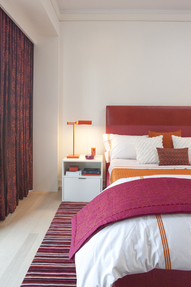
This rod is also dark, but the same thing isn't happening because the drapes are highly coloured and patterned.  I still would not use black.  In fact I probably would rarely use black because it is too harsh unless you have black drapes or it is a very modern decor. In this room I would look for something lighter that blended with the wooden blind too and make the whole thing more of a unit.

This is a good neutral colour when you have golden tones in a room. 

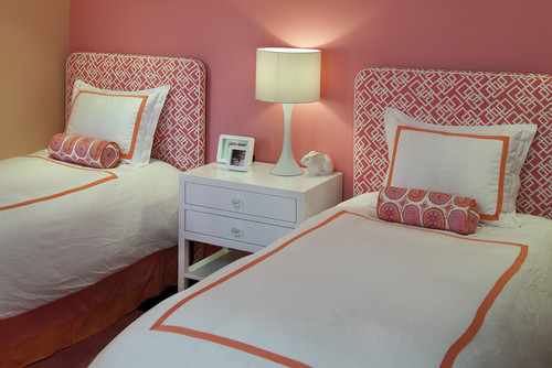
You also have to watch where you use wooden blinds. The combination below really works.   

bamboo roll up bamboo drapery rod  

 This is a very cohesive look.  When you add wood blinds you automatically introduce a more casual element to the space and usually the colour is lighter. Choose your rod accordingly.

back pleated drapes light gold rod

 This rod has enough colour to be noticed and it allows the drapes to have center stage. Imagine what a different room it would be if the rod  were black.

black drapery rod with banded drapes

How do you feel about this rod choice with these drapes?  Certainly  the black isn't as harsh as in some of the other examples, but it does compete a little too much with the horizontal banding for my taste. Personally I would choose something more neutral  to  match the top of the drapes.


light drapery rod cohesive look

A pulled together look. 


What are your thoughts on choosing an appropriate drapery rod for your space. Do  you have an aversion to black rods in light spaces?

Sunday, June 24, 2012

Not your average colour scheme

Some colour schemes are a dime a dozen and others are just daring and interesting. Today I'm looking at salmon/coral/melon and pink/rose/magenta.

Now I'm not saying I would use these colours in my own home. You can appreciate from afar without committing!  These rooms have just too much colour for my personal style.  I'm attracted to them because they are so vibrant and fresh.  Isn't it a good thing we don't all like the same colours?

 How do you feel about these rooms?  If you could transport any of them into your own home would you?

This colour scheme seems to be most popular in bedrooms. 

 Interior Designer Artistic Designs for Living, Tineke Triggs

The white bedding  and accessories work well to balance the hot colours.  White has many uses in decor and acting as a backdrop is just one of them.


You can't deny that these colours are great for a kid's room.  I'm really liking the hit of lime green as an accent.


This is the subtle version of this scheme.  Just a hint of melon with a deeper pink. Both are tempered with lots of off white.  That seems to be a common thread through most of these rooms.

More vibrant colours against light walls and furniture. The pink is leaning toward purple and there isn't that much of it. 

 This room turns it around and focuses on a rich magenta with smaller pops of orange. Do you think the headboard is dramatic enough or would you like to see a big piece of art over it?


Do you fancy one of these?

Living rooms


 Lots of white to play with these two vibrant colours. I'm longing for a little more pattern, perhaps a stripe with a third colour thrown in to replace the pink cushions. 

Here are some choice....


I would go for the purple one. How about you?
 
 While we're at it what let's think about the white vase... Hummm...

Choose one.  No matter what pillows you choose there's a vase that works.

  Can a room be over matched?  YES!


Deeper pink leaning toward red with just hints of orange give a totally different look.  In this room a neutral tan  in varying values serves as a backdrop to the vibrant colour. I like the fact that this room is not too over matched.  Lots of pattern in the pillows.


Simplified Bee®: Sweet, Modern Pink & Orange Nursery Room for Baby...

Vacation House

When I was in my younger days, I used to dream a lot and one of which is to have a vacation house. I remembered my family used to travel to Bohol (one of the beautiful places in the Philippines) during holidays and spent time with our relatives. One night, I stayed outside of the house sitting on the rock enjoying the cool breeze of the night while viewing the beautiful landscape facing the ocean.  An idea pop up in my mind saying “what if I build a vacation house in this place with a swimming pool”.  This could be the best place where my family and relatives could have fun and share quality time together. . It was really fun thinking of that dream. Of course, it ended up with a smile while walking back home for a dinner.

I am now in my thirties and I’ll keep on dreaming again and again.  I don’t mind when such dream would be realized as I believed that dream is a God’s blessing and seedlings of our reality.

To keep visualizing my dream house, I sketch a design of a house which for me suitable to my dream vacation house. Below is the perspective of the vacation house.

(Please click this image to see in a higher resolution)

(Please click this image to see in a higher resolution)


(Please click this image to see in a higher resolution)

 I think those series of day dreaming I had at a young age was never been a waste of time. In fact it was a visual aid to what I really want to have in the near future.

Friends, I am not an expert, but I believe that it is indeed necessary for all of us, both young and old to keep dreaming, believing in our dream, and put our dream into action.

I even start to understand that every great leader and successful people from the dawn of civilization down to the present was a dreamer who puts their dreams into action. 

Let us not forget, Columbus who dreamed of an unknown world staked his life on the existence of such a world, and discovered it. Henry Ford, a poor and uneducated, dreamed of a horseless carriage, went to work with what tools he possessed, without waiting for opportunity to favor him, and now evidence of his dream belts the entire earth. Thomas Edisondreamed of a lamp that could be operated by electricity, began where he stood to put his dream into action and despite more than ten thousand failures, he stood by that dream until he made it a physical reality. The Wright brothers dreamed of a machine that would fly through the air. Now one may see evidence all over the world that they dreamed soundly. Practical dreamers do not quit.

The greatest achievements were, at first and for a time, but a dream.

So long fellows, together we say it out loud with conviction,
In God’s name I will live my dreams. 

Living the dream,
Bernard Cadelina
"The architect" 

P.S. If ever you are looking for an architect to design your dream house, I might be of help, just send me  an email to philippinedreamhouse@gmail.com.

PPS. “Therefore I say unto you, all things whatsoever you pray and ask for, believe that you will receive them and you shall have them.” Mark 11:24

PPS. Do you have already a plan how you gonna achieve that dream? My dear friends I am inviting you to join Bro. Bo Sanchez Truly Rich Club. I had been a member of this club for a couple of years now and It had blessed me so much spiritually and financially. Please click this link http://bosanchezmembers.com/amember.

Tuesday, June 19, 2012

Hot seats


Dining rooms have a tendency to be formal affairs with matching table and chairs. but that doesn't mean they have to be. You can shake it up with unique styles and colours.    Here are some of my favourite Wow dining "sets" from my Pinterest collection. 

Make it  patterned


These luxurious chairs invite you to cozy up to the table. I'm a sucker for texture, and I would totally enjoy having a meal at this table.  Think of how soft the fabric would be!   I like the fact that the chairs  are patterned on the back and  plain on the opposite side.  The tufting supports the more traditional design and the high back chairs at the ends work well with the size of the space and the curves of the other chairs. The  hobbled roman shade is is a soft but clean window treatment in this room.  Lots of ideas to steal in this set up.

Repeated curves

 Lately I'm very attracted to everything aqua. Doesn't this colour look great with dark wood?  Curves abound in this room - in the draperies, the stairs, the chair arms, the vines in the carpet and in the light fixture. A soothing room all around with an unconventional chair colour.

 Popping yellow


Who could ignore these canary yellow chairs? I love the way everything else in the room plays second fiddle to the chairs and allows them to be the star. I want to whisk those red flowers away though. Don't we all have our opinions about what looks best.

Serene colour scheme


This room is different in every way from the one above. I love the clean lines of the benches and chairs . Remember that you need a central leg or an X leg if you want to move easily to and from a bench style seat. Armless banquettes are the most versatile.   The texture on the front of the buffet;  the circular ceramic vases with  twigs, and the rounded edges of the table add interesting lines and some complexity to the room. The colour and lines of the light fixture work well with everything else.  Doesn't this room look serene?

 Repetition of curves


More  banquettes, but this time paired with patterned chairs and a curvy table. The four leg table design will make getting into the banquette a little more difficult.The arms will add to the problem.    The chair  shape is repeated in the  mirror and the doors of the buffet.   An interesting mix.


There's nothing formal about this room! It will definitely appeal to the colour and texture lovers out there. I want to see a more substantial table with all this colour, but that's just me.

How do you feel about chairs and tables not matching?