Friday, May 30, 2014

Fabulous wall art inspiration

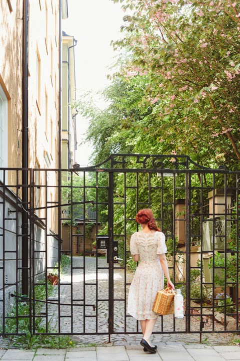
Today I'm in Edinburgh, Scotland for my sister's hen do. I love this city as it's also where I went to university a few years back. So much fun to be with the girls! I thought I'd stop in to share this wonderful summery image from Urban Outfitters and to wish you a very happy weekend!


Urban outfitters

More fabulous wall art inspiration here. And also I've hoarded images of all the wall spaces I love on this Pinterest board. Do you have any tips?

I hope you have a great couple of days! See you Monday with a home tour!


Thursday, May 29, 2014

Mini-Resort and Apartment

Hey folks, the heat of summer are still on, isn't it? Everyone, if not most of us would want to escape from the city's annoying atmosphere to relax with our friends, family or love ones. Some would go to the beach, mountains with refreshing water falls to connect with our mother nature; or to resorts for some with minimal budget just to cool down our summer....  Folks, I bet, this is a high time for me to design a mini resort with studio type apartment that is perfect for this summer season.


The distinct features of this mini resort project are a studio type's apartment along with.  Unlike other resorts, this is really not luxurious resort as what you might think or expect like those resorts in Boracay, Palawan, Surigao or Mindoro which are considered as one of the best luxurious resort  in the country, with palm tree lined beach front location and with world class amenities. 


This mini resort project has only a lot area of 950 square meters, however; we can still find ways to provide the client needs and preferences. This mini resort has two bedrooms rest house, six units of studio type apartment in a row, function hall cottage, swimming pool and parking spaces. The landscaping is not that complicated too, it is simple and practical which is just perfect to the lot.


My dear friends/followers, there can be a lot of overwhelming resort design can be seen online all over the world but only this resort design captures a "Pinoy" touch or preferences which is simple, refreshing but elegant.


Friends, every house is a dream come true.  Every dream house starts with a design. Let me do my part in your dream by providing you with the best practical design possible that suits to your needs. Live your dream house NOW!  Email to philippinedreamhouse@gmail.com.

Keep believing in your dreams. Keep dreaming, because dreams are the seedlings of our reality.


Living the dream, 
Architect Bernard Cadelina
"With God all things are possible" (Mat. 19:26).
PS. “Therefore I say unto you, all things whatsoever you pray and ask for, believe that you will receive them and you shall have them.”  Mark 11:24

So it is with faith: if it is alone and includes no actions, then it is dead. "James 2:17"

PPS. Do you already have a plan on how you will achieve that dream? My dear friends I am inviting you to join Bro. Bo Sanchez Truly Rich Club. I had been a member of this club for a couple of years now and it had blessed me so much spiritually and financially. Please click this link to sign up Truly Rich Club.

A pretty Stockholm space in pastels

The sitting room in this Stockholm apartment is so pretty. I love the pastel palette and the beautiful way it's been styled for the shoot by Maria Kangärde and Jessica Silver Saga for Fantastic Frank. The rest of the apartment is pretty lovely too and amazing how the owners have made a relatively small living space look so light and airy. It's located in Södermalm, a borough in Sweden's capital city known for it's rugged terrain and diverse shopping and entertainment  In other words, it's very a cool place to live. I could pad around here on a Thursday could you?


I spy the Muuto stacked shelving system, the Tulip table and a handbag very similar to my terracotta one from (one of my favourite high street stores) Cos (see this beautiful one by Dorayaky too).

For more pastel inspiration check out this label (such pretty spaces!).

Thank you so much for all your suggestions yesterday for somewhere to stay in the Dordogne this summer, I hope some of you make it to the fab camper in Nashville too (and if you do let us know what it's like!).

Have a lovely day!

Wednesday, May 28, 2014

The out house retreat of a Nashville author

It's that time of year when everyone starts last minute summer holiday bookings (OK I speak for myself - can anyone recommend anywhere last minute to stay in the Dordogne?!). Of course there are always hotels, B&B's and holiday cottage rentals but I also love to go quirky too and often consider glamping, tree houses and unique stay alternatives. And that's how I came across this cool 1962 Shaster camper.  Sitting in the back garden of 'Carry My Bones' author J. Wes Yoder in East Nashville, Tennessee, the camper has been lovingly renovated inside and out and includes an outdoor shower, bath house and terrace. When it's not in use as a work studio the author rents it out through Airbnb. Nashville anyone?!


Photography: Laura Dart via Remodelista

What a cute place to stay and a fabulous idea for an out house!

It's not the first time I've come across an unusually cool outhouse. Do you remember this  alternative garden shed for example?! I'm a big fan of outdoor bathroom's too, for inspiration take a peek at this outdoor bathroom post.

Other holiday sites I love right now include Alistair Sawdays Canopy & Stars which offers a collection of wonderful and quirky places to stay and Kid & Coe which makes travelling with children a whole lot easier - (what's not to love about that?!)! And if you're considering SouthWest England - one of my most memorable holidays ever was at Polgreen Glamping in Cornwall.

Do you have great holiday accommodation tips?


Tuesday, May 27, 2014

Elodie's very cool Bordeaux townhouse

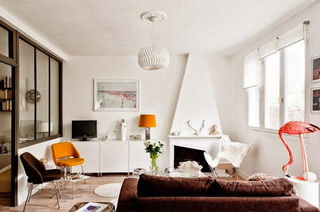
My younger sister and her beau are getting married just near Bordeaux, France this summer. So exciting! We're busy exploring places to stay right now which is why this beautiful French townhouse struck a chord with me today. You may have seen the dining room shot with the tulip chairs and fabulous artwork from this Bordeaux home before but the rest of the home is equally fantastic. I particularly love the touches of mustard yellow, how about you?


A big merci to Julien Fernandez  of Amandine & Jules interior photography for the kind permission. Via House of C

Did you spot the flamingo?!

The photographer behind these images, Julien Fernandez has been working on a wonderful personal project called 'we are inside' in which he has taken a sequence of images of French creatives in their studios / creative spaces. The photographs are so inspiring and well worth a look.

If you fancy a little more yellow inspiration today you might want to check out this link. It's amazing how spirits can be lifted in a space by adding one simple item in a bright hue! Do you have any yellow in your home?

Before I head off, I'm really excited to introduce a new sponsor, LiveAuctioneers. The spaces I show on here often feature antique and vintage items or mid-century finds and LiveAuctioneers is a great source for these fab treasures. I hope you'll join me in welcoming LiveAuctioneers to the fold.

Have a lovely day!

Monday, May 26, 2014

5 ways to avoid boring decor

Many of my clients remark  that my home must be perfectly decorated.   The answer is a resounding NO.   I actually have little interest in perfectly decorated homes because that usually means boring in my book. Besides, the reality is that there is only so much money and time that one can devote to a place to live.  You have a life, you have things you want to do, and often home projects get pushed to the bottom of the pile as you live with your decisions.  It's called setting priorities.

If you are spending your hard earned money on a place to live, how can you have the best space possible within your budget parameters?  This is a roundup of suggestions supported by  past posts that you might want to consider as you decide how to create an interesting home.

1. Don't try to keep up with the neighbours

  Don't go there. I've had lots of chats especially with young  professional first time homeowners who feel trapped in the friends' comparison games. You know the checks and balances  of where something was bought, the cost, the  hot style you need to have to be "successful". This is a trap for more than young homeowners.   Designing your house considering  such dictates will lead to a  very cookie cutter product (the show home look) and will possibly deplete your bank account at the same time.


white kitchen granite counter
Today's most popular kitchen look
 source


teal kitchen

 Rather than questioning if your home is up to par with the neighbour's, switch your thinking to how can I make my home unique. Not everyone is daring enough to have a teal kitchen, but it looks lovely and inviting and certainly isn't like ever other kitchen.  Read this to find  ways to add interest  your space.

 2.  Don't be a slave to trends  

 Trends come and go and adhering to them often means  changing  accessories, appliances and furniture more frequently than is warranted by normal wear and tear.  Are there trends that you should pay attention to?  I've discussed that topic here.  Would you be horrified to have white appliances,  natural oak hardwood or 80's European style cabinets?  ( I have all three)  Is granite the only countertop you would accept?  ( I have butcher block and laminate)!

yellow dining chairs timeless design
Timeless v.s. trendy
 
source

 Right now yellow, gray,  and black and white are "on trend", but I wouldn't call this space trendy.  Ten years from now this modern space warmed with wood and art will still look distinctive and inviting. 


chevrons antlers gray nursery
Chrvrons, antlers and gray

 source

 If you are at a home decor store every week  looking for accessories to add to your home,  you might be  going down the trend road. If you have chevron patterns, a chalkboard wall, antlers, cute lettered signs about family, love or keeping calm, lots of  baskets, or starburst mirrors, you are an accessory  trend follower.  Pinterest tells all!

3. Dare to have a personal style

 A more creative solution to home decor is  to determine what your personal style is and stick with that, adding select pieces over time. Make choices that reflect your family lifestyle and history. What makes your home yours?  Do you like antiques; are you a painted furniture aficionado; do you collect things or have travel mementos;  are you into yoga and zen spaces;  is music important to you;  are you a painter,  a wood worker,  a stained glass artist or photographer?  Reflect your loves in your space.  Check out this post for a more in depth look at what your house says about you.

zen bathroom
Distinctive zen bathroom

This is not your average bathroom space nor will it be everyone's cup of tea. That's the thing about personal style.  It should not be cookie cutter.   Each element is distinctive and they are creatively combined to produce a quiet, zen like space. 

green antique cabinet bathroom storage
 Antiques and interesting finds
source

 This bath has an interesting combination of antiques and practical objects.


 4. Forget about over matching 

There is nothing that sucks the soul out of a space more  than over matching. If I went through fifty spaces in a row on Pinterest on any one day, way too many of them are so perfectly matched they are downright boring.   Every space needs an edge, you choose what that edge is.  This post discusses the matchy match look and how to avoid it.

spa bathroom
 A well matched spa inspired bathroom

There is no doubt this is a restful space reminiscent of cool ocean breezes, but I would love to see at least one thing that was "out of theme". Something unexpected... a different mirror,  shelf  or light fixture.   


spa bathroom
Spa bathroom with interest
source

This is still a small bathroom space but materials have been used more creatively to produce a distinctive look. Imagine this space without the art work over the tub.  I would nix the plant.  I could see myself tripping over it every time I moved.


5. Move around what you have

 One of the first things I do when I begin a project with  clients who has hired me to  accessorize their space is ask them to pull out what they have stored. You would be surprised by  some of the finds that went from the basement to front and centre.   This post  will give you an idea of this type of thinking.

With so many ways to to create inviting, individual environments, do you have a favourite one that works in your space? 


A beautiful converted carpenter's workshop

Good morning Monday! Let's kick off the week with a beautiful conversion (I do love converted spaces how about you?!). This former carpenters workshop is currently for sale here in Skåne (tempted to go and take a look!). It's been carefully decorated to highlight the original features of the space including the exposed brick wall, steel beams and pipes. I love the monochrome colour scheme too, it fits the style of the space perfectly don't you think?


Peter Landgren via Husligheter
Anything that catches your eye?

Other favourite converted spaces include the home of a fashion designer in a converted bar, this former monks retreat and a fabulous barn conversion. I have a dream to live in a converted lighthouse one day (apparently it's quite tricky to decorate with all the rounded walls but imagine the views?!). How about you?

Thank you so much for entering the Rosendahl monkey give-away sponsored by the fab online shop Design 55. I am delighted to announce the winner as Amanda of Amanda takes a trip blog, I think this cheeky chap by Kay Bojesen will make a perfect flatmate for your new apartment!

Have a wonderful Monday!

Friday, May 23, 2014

The (truly beautiful) Line Apartment

You may already be familiar with The Line in New York but in case you're not, it's a beautiful online store selling pared back items and latest finds from emerging names across fashion, home and beauty. Already sold? Well, there's more. The Line believe objects gain new meaning and greater dimension through context and as a result have created The Apartment to showcase items in the intimate setting of a home. And what a beautiful home it is, don't you think?!


Copyright: Apartment34.comThe Line Apartment. Photography: Aubrie Pick via Seventeen Doors.

The Line has recently introduced Toteme the fashion brand created by Swedish stylist and blogger Elin Kling and Karl Lindman on their site which is well worth a look here.

And how cool is that blue velvet modern take on a chesterfield?! My parents have always had blue velvet chesterfields so they always remind me of my childhood. Keep an eye on LiveAuctioneer for similar. I pinned a space on my 'Moody' board the other day which had a surprisingly beautiful sitting room colour combination of dark blue velvet, dark grey and brass. You can see the image here (what do you think?).

Is there anything you love in particular about this space?

You might also want to take a peek at The Apartment in Copenhagen which works with the same concept. Also beautiful!

Are you doing anything great this weekend? I am at home with my sick three year old today (poor little thing) but I hope she'll be better by the weekend so we can do something fun in the sun.

Have a wonderful couple of days and see you Monday!

PS don't forget to enter the Rosendahl Monkey give-away which closes Sunday

Thursday, May 22, 2014

A Stockholm apartment with a 'twist'!

Hello Thursday! I wasn't kidding when I said this Stockholm apartment has a 'twist'. Currently for sale through Fantastic Frank it has been styled with a strong theme throughout -  'cross-legged' or 'twisted' furniture legs! Look closely and you'll see them everywhere. How very cool! I also love some of the subtle light grey walls which soften up the starkness of the white. How about you?


Fantastic Frank via Emmas Design blog

Many of the items you see are from fab brands No Early Birds and One Nordic.

Fantastic Frank are pioneers in exploring funky ways to style an apartment for sale (see cool examples of their homes here, here and here).

This is catching on across the Swedish estate agent scene and recently a home swept across Swedish Facebook sites because one seller took funky styling to a new level. Take a look for yourself here and see if you recognise a link between the rooms?!!

Have a wonderful Thursday!