Thursday, October 31, 2013

The beautiful apartment of a Swedish interior designer

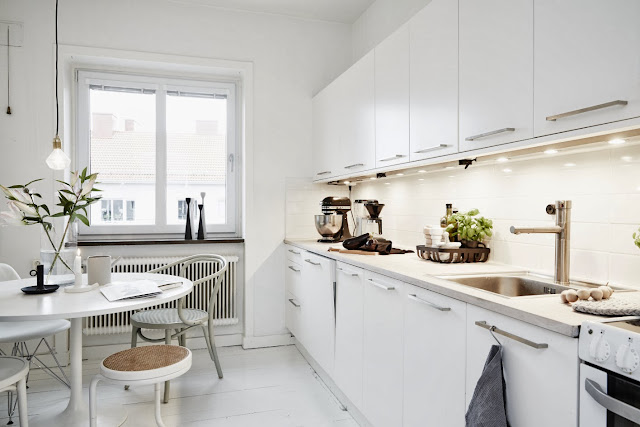
Hej du! I'm blogging from further up the coast today in Höganäs (home to Lily & Oscar (remember this beautiful cottage?) and Magasin 36 which I fully intend on visiting!). But before I do I had to share this incredible home with you which is currently for sale. It's owned by Swedish interior designer Elin Kickén (and I've heard Instagram extroadinaire (@elinkicken) and teeming with fabulous pieces. Take a peek....


Elin Kicken, Vastenhem via Husligheter and Stil Inspiration with thanks. 
I love her style, how about you?

I spy (where to start?!!) - well you could do well to start at Lotta Agaton's pop-up shop where many of the accessories can be found including the black and white prints, the Hay wall calendar and diamond light bulbs. For other items: Muuto The Dots Coat Hanger, Tom Dixon Copper Shade light and etch tea light (Nest). The Eames DAW, Eames RARThonet 209, Thonet 214, (Design Collectors: 15% discount with code MYSCAN).  Kubus bowl By Lassen. Linen bedding from The Linen Works (I love the Cassis colour). Long-haired sheepskin chair cushions from here. What have I missed?

Feel like looking at a few other monochrome spaces? Try this, this and this one!

Oh and don't forget to enter the give-away if you haven't already :)

Have a lovely day and happy halloween Mwah, ha ha haaaa!

Tuesday, October 29, 2013

Philippine Dream house in Africa.

Does this dream house looks familiar to you? Yes, Indeed it is! as this was the same house design which I posted in my previous  blog entitled "Post Modern House" in 2011.  As I recalled, I conceptualized the design of this house during my past time.  But this house will soon rising in Africa.  Can you believe that? Kinda overwhelming feeling.......

So much for that, here's the perspective of said house design.

In terms of size and measurements, this house has a building area of 156 sqm. It has three bedrooms, two bathrooms plus the usual areas like living room, kitchen and dining. As you can see, this dream house has enough perimeter space to expand and this shows a lot of potential. The most exciting part of the house is  the living room which opens up directly into  the front yard, in which you can see more of green and landscape with great area where children can speciously play.

I was hesitant at first accepting this project in Africa as I do not actually does business outside the Philippines.   Eventually, I came to realize, "why  don't i give a try?".   Thanks God this project goes very well. I still believe that our world is still filled with honest, good or trust worthy and God fearing people.

My dear friends/followers, there can be a lot of overwhelming house design can be seen online all over the world. But only this house design captures"Pinoy" preferences which are simple, refreshing but elegant house.

Friends, every house is a dream come true.  Every dream house starts with a design. Let me do my part in your dream by providing you with the best practical design possible that suits to your needs. Live your dream house NOW!  Email to philippinedreamhouse@gmail.com.

Keep believing in your dreams. Keep dreaming, because dreams are the seedlings of our reality.

Living the dream,

Architect Bernard Cadelina
"With God all things are possible" (Mat. 19:26).

PS. “Therefore I say unto you, all things whatsoever you pray and ask for, believe that you will receive them and you shall have them.”  Mark 11:24

So it is with faith: if it is alone and includes no actions, then it is dead. "James 2:17"

PPS. My dear friends I am inviting you to join Bro. Bo Sanchez Truly Rich Club. I had been a member of this club for a couple of years now and it had blessed me so much spiritually and financially. Please click this link to sign up http://bern_cadelina.trulyrichclub.com/.

A Dutch artist's atelier and home

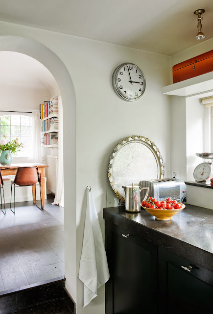
From stormy Southern Sweden to a calm oasis in Laren, Holland. This artists atelier was built in 1913 and  has been converted into a beautiful apartment by owners Pam and artist André Wiegel (much of whose work you can see on the wall today). The large windows and North facing facade create the perfect light to work in. The dark wood floors and white walls are complimented by warm Turkish textiles and wooden furniture, books and vignettes. Such a lovely, homely space.


Styling Frans Uyterlinde. Photography: James Stokes with kind permission. VT Wonen 2012

I could live and work here, could you?

The rug in this home is so beautiful I can't help think a long weekend in Istanbul is on the cards...

Other beautiful items? The dining chairs are awesome. The Tom Dixon pendant light always a favourite. I also like the touch of linen in the bathroom. How about you?

See other beautiful ateliers here.

Don't forget to enter the exciting give-away to win a Ferm Living Candleholder, still a few days left!

Have a lovely day!

Monday, October 28, 2013

A Swedish west coast retreat, family home and studio

Hello Monday! A storm is brewing here in Southern Sweden, and although I don't want to be out in it, I'm looking forward to the prospect of batoning down the hatches, getting out the blankets and lighting a few candles. This definitely calls for a cosy home exposed to the perils of nature. This Swedish retreat by the sea in Frilesas, Halland (not far from here) was originally designed and built by owner Fred, a carpenter. He was looking for a weekend bolthole and decided to keep it small, open-plan, simple and modern. But when he met his partner Lina, a designer, they decided to extend it to create a family home and a studio from which Lina could work. Now Lina and Fred  live here with their 6 month old son Stig and it's undeniably cosy, warm and welcoming. A perfect haven from a storm raging outside!


Lantliv by  Maria Delice  Karlsson with kind permission.

Could you ride out a storm in here?! 

Read more about it here (in Swedish). Or check out other cosy Swedish retreat's here (romantic log cabin anyone?!) and here.

In the last image I spy a sheepskin rug - which leads me to my latest news - I'm very excited to welcome my new sponsor BLACK SHEEP (WHITE LIGHT) purveyor of eco-friendly icelandic sheepskins and other select natural design products. I have my eye on this one in particular! They also ship worldwide - perfect! Thank you for supporting the sponsors that make this blog possible.

PS Oh and the other piece of exciting news is that my home is featured in the November edition of IKEA Family Live! I'm a big fan of IKEA as you know, so it's an honour to be included!

I hope you had a lovely weekend!

Sunday, October 27, 2013

Does anyone actually read my blog?

Your friends and family keep you on your toes and often unwittingly provide great fodder for blog posts!  They also cause a scattered examination of conscience.  Two recent questions about my blogging ( I have a painting blog and a home decorating blog) got me thinking about my purpose and audience, and the time I invest in this activity. This post is about Designing Home blog

Audience
  I am happy to report that people do indeed read Designing Home blog. Since I began it almost three years ago,  I've had over .25 million page views.  That surprised even me because I originally began to write this blog with a local audience in mind.  I couldn't be further from the mark.


  My readership is 6 times larger in the United States  than Canada.  Canada, Great Britian, Australia and Germany are almost tied in interest.  Only a small percentage of readers are actually from Newfoundland.  No doubt it is a global village.

Topics
I am glad that my original prediction about audience was correct. The average homeowner appears to welcome clear information about basic decorating issues.  You now, the kind of questions you have if you live in an  average size home and decorate with a modest budget.  Personally that means a very modest budget layered with a lot of DIY.  While I write about other topics that appeal to smaller audiences, I try to keep my focus "sensible". Here are the top five posts on Designing Home:

May 2, 2012, 38 comments


Houzz

Mar 17, 2011, 10 comments


Mar 4, 2012, 16 comments


Rosedale Living Room Drape Vignette modern living room

Jun 14, 2011, 9 comments


Aquamar Bathtub modern bathroom 
                                                     PSCBATH

It appears that many people have issues with small rooms and are looking for creative ways to use space.  Window treatments, accent walls and hanging light fixtures are topics that everyone thinks about.

Purpose 
Why  would I use a chunk of my valuable time to write?

 The biggest joke of all is I don't actually enjoy writing.  I find it labour intensive and a clumsy way to provide knowledge although I am an avid reader.  I am definitely a face to face communicator who needs the visual signals of my audience to be completely comfortable.  It comes from years of teaching both children and adults. I am also a huge synthesizer. I like to get things down to the bare bones quickly.  A colleague once told me I write like a machine gun.  I am obviously not a highly verbal person - I am a doer.

But.... I love to organize and share information. It just makes me happy.  The learner/ synthesizer function wins.  

Blogging also provides a forum to research questions or problems that arise as I work with clients.  It has expanded my horizons in so many ways when it comes to interior design. The design community is diverse and blogging keeps me in touch with trends from around the world.  That is a necessity when you live on an island where attitudes can tend toward the provincial and predictable.

Blogging  increases your credibility.  When you have a blog /website as I do, you have a showcase for your understanding of design issues and people can anonymously " check you out".  There are lots of lurkers out there from my stats.  2542 people checked out my portfolios , 798 read my design statement and 540 wanted to know more about me.

Yes, people are reading my blog.  It serves its purpose.

Signing  out from my not so decorative small computer space....

    
  As you can see, I live in a very average space and I am also a little sloppy at times. Why I have a pair of pliers on my desk is a mystery. This desk came  from a contractor friend  who  renovated a  university residence.  The walls are BM CC 460 inukshuk  and the desk is painted BM HC 69 whitall brown. The resident carpenter built the bookcase to fit the equipment. 

Friday, October 25, 2013

And more aqua

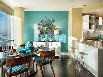
This must be aqua week! I am noticing it everywhere.  After writing a post yesterday about aqua, I opened one of the blogs I follow this morning to be greeted by a lovely room make -over by Kelly Porter of Color Sizzle and the walls are painted aqua. The accents are red.  I wanted to share this lively combination.  While it is too much colour for me, I know it will appeal to lots of my readers. 

Pillow and lamp love on my part! 


And another living room with the same colour scheme, but the colours are used in a very understated way. It is all about the intensity of the hues.

Which room would you be most comfortable in?

GIVE-AWAY: Win a Ferm Living Candleholder from Nest

I am so excited to announce today's give-away offering you the chance to win a Ferm Living Candleholder String from the fab online interior shop Nest.co.uk

The Danish designed Candleholder String comes in beech wood with a leather string and place for four candles. You decide how it all goes together. As the day's get darker with the clocks going back this weekend (here at least!) and Christmas approaching (did I just mention the c word?!) it's the perfect way to light up your home the Scandinavian way - using cosy candlelight. 


For your chance to win a Candleholder String from Nest.co.uk all you need to do is:

1. Visit Nest.co.uk and choose your favourite item. In the comment section below briefly state which one you've chosen and why. 
2. Sign up for the Nest.co.uk newsletter here (bottom left of page).


This give-away is open to everyone worldwide. Be sure to enter latest midnight GMT Sunday, 3rd November. The winner will be announced on Monday, 4th November through My Scandinavian Home blog, Twitter and Facebook, don't forget to leave a way to be contacted too!


Good luck!

Thursday, October 24, 2013

May I suggest aqua?

Although I am interested in the latest colour trends in home decor, I am not a slave to them.  I choose gray as the neutral in my house in 1986 and it wasn't a  growing trend until 2011!  It will still be my neutral ten years from now because I feel comfortable with gray as a backdrop.

 We should all choose colours for our homes that we like.  My first order of business in a colour consultation is to determine what kind of colours a client really likes.   Next I check the room's light  orientation and lastly I look at the furniture and art in a space.

I just went through all my pins on  my colour inspiration board on Pinterest to look for trends in my own pinning.  I have quite a few with aqua.  I do not have aqua in either of my homes, but I am obviously attracted to it  because I love blue greens.  How about you?

Aqua is a versatile, fresh colour as you can see from the interiors below.   You can use it for an accent wall, to paint furniture, in pillows, or even on  a ceiling....use a little or a lot....


 Aqua as an accent wall with lots of cream is stunning.

 A more intense aqua with citron green and a pop of magenta... perfect for a teen's room!


 Serene gray with aqua accessories.

The same scheme as above with black added. 

 Aqua and white with a hit of darker  blue.


 And who wouldn't want to have a chat in this sun room? Creamy white mixed with green and aqua is so  fresh and inviting.

 Just loving the hit of red with aqua in this boy's space. I think aqua is the perfect colour to paint a piece of furniture and look at those shutters!

 I've always loved this colour combination  with rattan or any mid toned wood. A liberal amount of white is needed to prevent over saturation.

 And here we have the merest hint of a dark aqua with magenta and off white.  This is a great way to have pops of colour without over committing.

  An interesting colour combination with great pattern choices too.


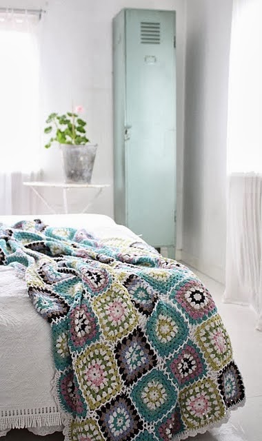
 If you're feeling a little vintage aqua makes a great accent.

  And just this one little pop of aqua glass makes a nice punctuation mark to end the post. 

All links on my Pinterest board indicated above