Wednesday, February 27, 2013

Post Modern House-2 (updates)

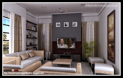
Friends, did you still remember my old post entitled Post modern house-2 , modern living room, modern dining and kitchen design combine, and the living room christmas decoration? I hope you still remember those great post of mine (aheem!!!) and I hope you like them too. Kidding aside, actually they are in one roof; I mean they are all in one house. I just post it individually before and now I decided to show it all in one post. 
Drum roll please!!! For those of you who are looking for an inspiration of post-modern house, modern living room, modern dining and kitchen room in the Philippines here's my simple and practical design that might inspire you or something of that nature.


If we will recall that postmodern architecture began as an international style the first examples of which are generally cited as being from the 1950s, but did not become a style until the late 1970s and continues to influence present-day architecture. Post modernity in architecture is said to be heralded by the return of "wit, ornament and reference" to architecture in response to the formalism of the International Style of modernism. As with many cultural fashions, some of Postmodernism's most pronounced and visible ideas can be seen in architecture. The functional and formalized shapes and spaces of the modernist style are replaced by diverse aesthetics: styles collide, form is adopted for its own sake, and new ways of viewing familiar styles and space abound. Perhaps most obviously, architects rediscovered the expressive and symbolic value of architectural elements and forms that had evolved through centuries of building which had been abandoned by the modern style.


Click this image to see in higher resolution.
The living room


Click this image to see in higher resolution.

Click this image to see in higher resolution.
The kitchen and Dining


My dear friends, this might not be the very best postmodern house design or the best architectural design online or the best online interior design you can see in the world or in the Philippines but for someone, somewhere it might be the best dream house design they could ever imagine. And this is for you my friend.

Friends, every house is a dream come true.  Every dream house starts with a design. Let me do my part in your dream by providing you with the best practical design possible that suits your needs. Live your dream house NOW!  Email to philippinedreamhouse@gmail.com.

Living the dream,
Architect Bernard Cadelina
"With God all things are possible" (Mat. 19:26).

PS. “Therefore I say unto you, all things whatsoever you pray and ask for, believe that you will receive them and you shall have them.”  Mark 11:24


PPS. Do you have already a plan on how you gonna achieve that dream? My dear friends I am inviting you to join Bro. Bo Sanchez Truly Rich Club. I had been a member of this club for a couple of years now and It had blessed me so much spiritually and financially. Please click this link  http://bern_cadelina.trulyrichclub.com/

Saturday, February 23, 2013

Kissing objects and other design issues

This is the first post of a series I have planned to focus on arranging objects in a pleasing way in your home.

 The same principles of design that are the backbone of a good painting can be applied to designing a room or a vignette.  People often know when something doesn't look right , but they might not be able to articulate why they have that feeling. I thought I would focus on some of the finer points that can move a space from fine to fantastic.

Do you have....

Kissing objects
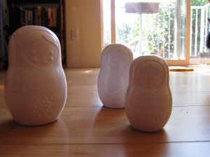
 That's the best way to describe objects that touch each other or look like they are touching  thus causing an odd tension/confusion.  Is it one object? Two objects? Why are they side by side? etc.


These two nesting dolls tell the story.  Do you want to move them apart? Another thing that happens when object touch or are too close together is the creation of boring negative space especially when the objects have the same form. You can see that the shape between the two dolls in almost symmetrical.


 When the objects are overlapped slightly you create more visual interest and depth.  If you can add a third object for variety, so much the better. Note the spacing in the middle.


 I would be the first person to admit that there are beautiful objects in this collection, but I want to appreciate them individually. 

 If you have a huge quantity of objects in a collection you might be better served by choosing a more thougtht out way of displaying them rather than massing them together randomly.  This collection reads as quantity and the beautiful forms are lost in the "gathering". 


 Exception to the rule
Then there is the exception to the rule. I don't think having the two pots touching in this vignette is at all boring because of the variety in direction and shape created by the small trees.  The enclosed space between the pots is interesting because of the legs.  There is so much else going on that this just works well.


 Furniture can kiss too!  When you have a curved/slanted arm on a sofa or chair move your end table out so it is not touching the sofa. It frees up space and creates visual ease. If the arm of sofa is curved you often have to move a table out even further.


Monday, February 18, 2013

The dish on modern design


Modern style is a clean, streamlined furniture and architecture style that first appeared in the  1930s with roots in the German Bauhaus School of Design and Scandinavian modern design.   The modern movement was a response to what happened in design and history up to that point.  Art, architecture and  interior design broke from traditional detailing and styles and forged a new path. Modern design is still a prominent style in today's homes where homeowners seek original mid century modern furniture and accessories or resort to reproduction pieces.

  Defining characteristics of  modern interior design include:

 John Maniscalco Architecture
  •  simple, minimal, flat surfaces and unbroken lines 
  • low profile furniture with raised legs for an airy look 
  • wood floors but sometimes, cork, cement or rubber
  • minimal accessories


  • emphasis on form, geometric shapes
  • large windows that let the outside in
  • natural elements for accessories (large plants, sculptural twigs)
 

    • use of metals, leather and glass

      •  molded plywood, clear and white plastics for furniture

       
      •  simple or no hardware


      George Nijland
      •  predominately light walls, especially white
      • controlled use of pure colours in furniture/accessories ( mostly red, yellow, blue) 
      • use of texture 
      • use of art to add colour,  design elements and a focal point


        use of geometric patterning


        Many of the iconic furniture pieces of mid century design are still reproduced today and this confuses people because modern  is not that new! What some consider leading edge has been popular since the middle of the century.
         

         One of the strongest trends in home decor  today is to mix  modern pieces with contemporary decor.   The overall tone of this room is mid century  modern , but the severity of line and the more minimal approach has been softened with accessories.  Removing flowers, books, vases and pillows would create a truly modern decor.


         In my own home I like to mix mid century modern  pieces like the dresser, bed and chair with softer accents and a range of patterns and textures.


        Wednesday, February 13, 2013

        6 effective uses for valances

        A client recently asked me if valances were outdated.  Of course the answer is never yes or no in decor;   it's usually "that depends".  When it comes to window treatments for 2013 the key works are  streamlined  and crisp.  The once popular love for  yards of gathered  or draped material, floppy tabs and ruffles has died a quiet death.

         A valance is a  soft  window treatment  made from fabric that is used at the top of  a window and usually mounted on a strip of wood or a  velcro rod.  Valances  conceal drapery hardware, blinds  or architectural flaws and are commonly used in more traditional decor to add layers and soften the decor.

        Valances are not to be confused with cornices that are usually structured from wood and padded.


         I still recommend valances for certain windows and rooms, but you won't see a gather or tab in sight.


        1.  Soften a bare window 

        Sometimes you have windows were privacy is not an issue and you don't want to have bare windows. A fitted valance is a great way to add softness without covering the window.


        Margaret Ryall


        These  banded valances   with  tassels function well in a more traditional home.  The pattern duplicated in pillows  serves to move the eye around the room.  This application works well because  the colour scheme is neutral and nothing is overpowered.


        This space has a totally different feel- a more sparce contemporary one.   I believe that this is a cornice,  but the same look could be achieved with a valance in white and gray.


        2. To soften the look of roman shades/blinds


        This is a great solution for multiple windows.  The roman shades are mounted separately and the valance is continuous.  The colours are neutral and the added decorative motifs add sophistication to this otherwise plain window treatment.


        A colourful floral fabric adds  pattern to this pastel kitchen.  When using woven blinds choose a fabric that has the colour of the blind integrated in the pattern  to achieve a more cohesive look.  


        In cases where a valance is covering a blind it is best to have an outside mount.   In this way the blind can move easily if it needs to be raised.  This placement also add more prominence to the treatment. I like the way the energy of the circles works with the horizontal lines of the blind.  Curves help to soften the horizontal lines that are common in most blinds.


        This tight colour scheme of white and pink is duplicated in the  valance.  The scalloped valance is feminine and soft, fitting in with the overall decor.

        3.  To add pattern to a space 


        4. To hide blinds in the daytime


         5. To give draperies a finished look

          
         Valances are a great when you have multiple windows in a room because they provide a horizontal line  against the verticals of the drapes and provide an additional layer in the room. This look works well in more traditional decor.


        6.  To make a statement in a kid's room


         What a great idea for any colour scheme in a little girl's room.  Easy as installing a rod ( I sometimes use shower  tension rods if the width  is large enough) and tying a knot in lengths of ribbon.  What is great about this idea is the option of adding lots of pattern in the ribbons if you wish.


        Use nautical signal flags attached to a strip for a colourful boy's valance.


        Saturday, February 9, 2013

        Kitchen cabinet colour trends

        My choice for kitchen cabinets has always been white because I just don't like living with dark colours or too much wood grain. I liked white before it became popular; I fought the natural oak trend when we built our home in the mid 80's and now that  dark stained cabinets seem to be the going trend where I live, I continue to love white.

        Just how popular are white cabinets?

          I decided to conduct a very unscientific poll using the kitchen section of Houzz.   I looked at the first 50 pictures of long views of kitchens  sorted by most popular today and here is what I found out:  Of the 50.....

        8% were  natural wood or stained wood

         There was a mix of  stains...


        ....from this very dark espresso like colour ...


        .... to a mid value cherry....

        Christian Gladu Design

        .....to natural wood .


         14% were painted colours other than white/cream  


        Most of the cabinet  were lighter colours so this black  kitchen stood out. I think it works in dark because it is open to a much larger space and there is a liberal use of light creams and white. Working with dark cabinets has to be a balancing act or you end up with a cave.


        Yellow was perhaps the most  unusual colour choice   of the fifty surveyed kitchens and you would really have to love yellow to live in this kitchen. 

         You can never go wrong with a soft colour for kitchen cabinets.  This creamy green is light enough to open up the space, but you can still define it as a colour.  I think it was a good solution in this Craftsman style house where the traditional finish would have been stained wood.

        JLF & Associates, Inc.

        Who would ever think of a grayed lavender as a cabinet colour, but it really works in this atrium kitchen. The wood tone in the medium stained island  is repeated in several places throughout the space to create visual harmony. Grays with purple undertones actually work really well with mid toned woods, but it not a colour everyone likes. 

        22% were white/cream with dark islands
         
        Kitchen And Bath Venegas and Company

        I think the darker island concept with white kitchens works really well  to add drama to a space. This  dark colour also grounds the room and integrates well with a darker hardwood floor.    Oh, to have all those drawers!
         Great Spaces!

        Of the darker islands, the most prevalent colour was a deep stained brown.

         
        2 % were white with a lighter coloured island 


         I think the soft blue/green works great with the wood tones in this very Mediterranean  styled kitchen.

        54 % were white or off white
          

         Of the kitchens I showed did you notice what the most popular floor treatment was?


        And there you have it.  What's your favourite cabinet finish?


        Friday, February 8, 2013

        Have a little heart

        Young children often call Valentine's Day "heart day" .  The heart motif is constantly used in home accessories and these gems aren't just for Valentine's Day; they add lightness and love to your home all year round.   Have you woven any hearts into your home decor?


        This simple, graphic pillow  would look great layered with other pillows that have hits of red. The stitching and asymmetrical layout makes the design.


        Totally Tutorials

        Creating a wrapped yarn heart over a wooden or cardboard heart is so simple.  If you create two different sizes you can hang one inside the other.


        How about Oragne?

        A great activity if you are bored.


        In 1930s Hungary, farmers  personalized the designs of their grain sacks so that they could easily identify the bag while transporting grain, flour or sugar. Some of these distinct grain sacks are being repurposed as decorative pillows for the home.  A pillow with history....


        Design Sponge

        Lots of ideas here for interesting, creative wrapping for your Valentine.


        When you poke around on the internet you will find all sorts of ideas for do- it- yourself art with heart motifs. Most of the really successful ones make use of repetition as the  predominant principle of design.  


        Arnold Schulman Design Group

        This is one spectacular bookcase and the little hits of pink hearts are adorable.
         
        London Interior Designer LLI Design

         Can you find the hearts?